What things come to mind when you read “simplicity” or “fresh” or “trust?” Likely the majority of the phrases and images that pop into your brain are the same as other people. When it comes to creating an effective logo, it’s these generally accepted notions and associations that designers use to communicate basic concepts to a target audience.
At their most basic, logos are used as a tool to identify your brand in an instant; a stand-alone graphical representation of a brand. It differentiates your organization from others who provide similar products and services. However, there is so much more that goes into logo creation. So, before you pick up a pencil, open a graphic design program, or call your artist friend to design a logo, keep these elements in mind.
Armed with Information
Perhaps surprising to some, a logo has as much to do with words as it does to do with colors and images. Information that might normally be associated with messaging and product marketing are actually just as important to lay the foundation of an effective logo. Our designer, Kylie, asks clients seeking a logo to provide words that they feel describe the brand. Here are some other things that are important to keep in mind when designing a logo:
- What distinguishes you from other companies in your field?
- Name two emotions you feel are associated with your brand.
- What words would you never want someone to use to describe your brand?
The translation of these descriptors into elements of a logo is where the magic happens.
Legible
First thing’s first, a logo needs to be read. This obviously applies to textual-based logos, however, even image logos must be easy to “read.” If a logo includes an eagle, your audience must be able to identify it as such at just a glance. The worst thing a logo could do is confuse your current and prospective customers.
Any brand design assets must choose clarity over cleverness. That is not to say that a clever logo is never clear, but if the visual pun in your logo is clearer than your brand identity, then it’s difficult for your audience to connect with anything else.





Simple
Coco Chanel was said to have advised the following when dressing with accessories: “Before you leave the house, look in the mirror and take one thing off.” The same can be said of your brand’s logo. It should represent the essence of your brand, not every feature of your products and services.
Let the logo speak for itself, rather than force-feeding meaning. People are good at making connections and filling in the gaps, so use that to your advantage. Some associations are straightforward, such as a globe icon representing a business focused on international solutions. Others, such as a light bulb representing innovation, require our brains to do a bit more work, but offer the benefit of additional connections to intelligence, invention, and creativity.
Associations are based on culture, however, so if you plan on doing business with those in other countries or cultures, consider what assumptions you hold and how they could differ from your intended audience.
Versatile
Think through where your logo will show up and the implications of using certain elements. Will it need to be printed? Will it ever show up on a clothing item? A solid design should be configured for digital and print in every scale and shape.
Another thing to think about for printed designs such as hats or shirts is that the more colors you use in design, the more expensive it can be. This is because all the colors need to be separated and applied as different layers, with the price increasing for each pass of color.
Color
Color theory influences logo creation quite a bit because certain colors evoke different feelings. Have you noticed how much red shows up in fast food marketing and branding? Or the number of fashion brands using black in their logos?
When choosing colors for a branded logo, check out some of your competitors, and take note of any regularly-used colors in your industry and choose colors that make your brand stand out. For example, software development organizations often use blue so you might choose a warm color.
“Creating color palettes is one of my favorite aspects of client branding,” says Kylie. “I try to either have a set palette before I create a logo or no palette at all. There are some fabulous and fun tools for color palette creating in the Adobe suite and elsewhere.”
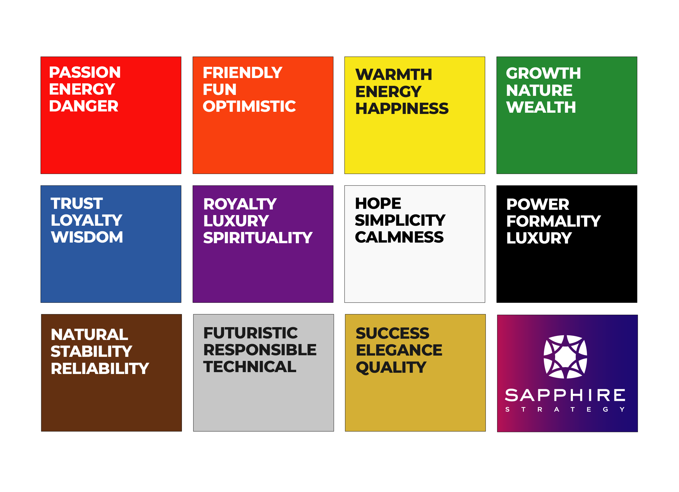
Overall, a logo should be intentional. A well-versed designer will take into account the elements above to create a visual representation of your brand that your audience will recognize and connect with.
Making aesthetic choices for your brand should be based on more than a whim. Paired with an understanding behind the psychology of colors and different fonts to guide our decisions, we’ll work with your team to think about your overall aesthetic choices.
Whether you’d like to revamp an old logo, create a standardized brand guide, or start from scratch, we have an amazing design team that can bring your brand to life.
